
When online sales are soft, most store owners look straight at the checkout. They tweak the button color, shorten the form, add another payment option, and hope the numbers move. Sometimes they do, a little. But the checkout is the very end of a long journey, and by the time a shopper reaches it, most of the people who were going to leave have already left.
If you want to sell more, it helps to understand where customers actually drop off, and most of those moments happen well before anyone clicks buy.
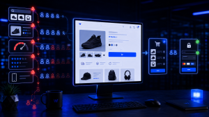
The product page does more selling than you think
For an online store, the product page is the storefront, the salesperson, and the fitting room all at once. Shoppers cannot pick the item up, so the page has to answer every question they would ask in person. Thin descriptions, a single small photo, or missing details like sizing, materials, or shipping timelines create doubt, and doubt is the enemy of a sale.
- Multiple clear photos from different angles, including scale and detail shots.
- Descriptions that address real questions, not just a list of specifications.
- Reviews and ratings, which reassure hesitant buyers better than any marketing copy.
Slow pages quietly bleed revenue
Every extra second a page takes to load costs you shoppers, and the effect compounds on mobile, where much of today’s shopping happens. A store that feels sluggish signals risk, and shoppers who feel any friction simply back out and buy elsewhere. Speed is not a technical nicety here. It is directly tied to how much you sell.
Surprise costs are the number one cart killer
When shoppers do abandon a cart, the leading reason is not a clunky checkout. It is unexpected costs appearing at the last step: shipping fees, handling, taxes they did not anticipate. The customer carried one price in their head the whole way through, and the final total feels like a bait and switch. The fix is honesty earlier. Show shipping costs and free-shipping thresholds up front, and there is no nasty surprise waiting at the end.
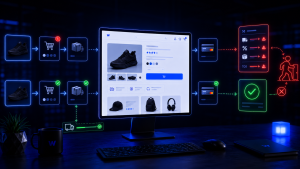
Trust gaps stop people from entering payment details
Handing over a card online requires trust, and small signals build or break it. A missing security indicator, no visible return policy, no contact information, or a design that feels slightly off can be enough to make a cautious shopper close the tab. Clear policies, obvious contact options, recognizable payment logos, and a professional design all work together to say you are safe here.
- Display return and refund policies where they are easy to find.
- Offer familiar, trusted payment methods.
- Make it obvious there is a real business behind the store.
Forced account creation sends people packing
One of the quietest sale killers is demanding that a first-time buyer create an account before they can pay. Someone who just wants one item does not want to invent another password and hand over more information than the purchase requires. Offering a guest checkout, with the option to save details afterward, removes a wall that a surprising number of ready buyers refuse to climb. Ask for what you need to complete the order and nothing more.
The path to the product matters too
Even a perfect product page cannot help a shopper who never finds it. Confusing navigation, weak search, and unclear categories send people in circles until they give up. A store that guides visitors smoothly from landing to product to cart removes friction at every step, and each removed obstacle is a sale you would otherwise have lost. Pay special attention to mobile, where cramped menus and tiny buttons turn browsing into a chore and quietly push shoppers away on the very devices most of them are using.
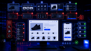
Not every shopper is ready today, and that is fine
Some visitors are genuinely interested but not prepared to buy on this visit. They are comparing options, waiting for payday, or simply thinking it over. Losing them in the moment does not have to mean losing them for good. A simple email or text capture, a saved cart, or a gentle reminder about the item they left behind gives you a way to bring them back when they are ready. Recovering even a fraction of these shoppers can meaningfully lift sales, and it costs far less than finding brand-new visitors to replace them.
The takeaway
The checkout is worth optimizing, but it is the last mile, not the whole road. Most lost sales trace back to earlier moments: a product page that did not persuade, a page that loaded too slowly, a cost that appeared too late, a trust signal that was missing, or an account wall that asked for too much. Fix those, and the checkout starts converting the customers who were ready all along.